

Web Design · User Experience · Digital Marketing
Mobile-First Web Design: 20 Years Later, Are We Still Designing for the Wrong Screen?
Mobile-first was a necessary correction to a web designed around desktop monitors. But twenty years after the mid-2000s web, treating mobile-first as an automatic rule can be just as lazy. The better question is: what does the user’s context actually demand?
There is a contradiction I still notice when websites are commissioned.
An agency will explain that mobile matters enormously. They will show the analytics. Perhaps 60%, 70% or 80% of the traffic is coming from phones. They will talk about responsive design, mobile usability and designing for the customer rather than the boardroom.
Then they unveil the design.
On a desktop monitor.
And, to be fair, I understand why.
Websites usually look more impressive on a big screen. There is more space for photography, more room for typography, more opportunity to show the clever bits of the design. It is also where much of the design work is actually being done.
So despite years of being told to think mobile-first, it is very easy for teams to continue designing desktop-first in practice and then work out how to compress the result afterwards.
Mobile-first was supposed to change the order of thinking, not merely the order of the breakpoints.
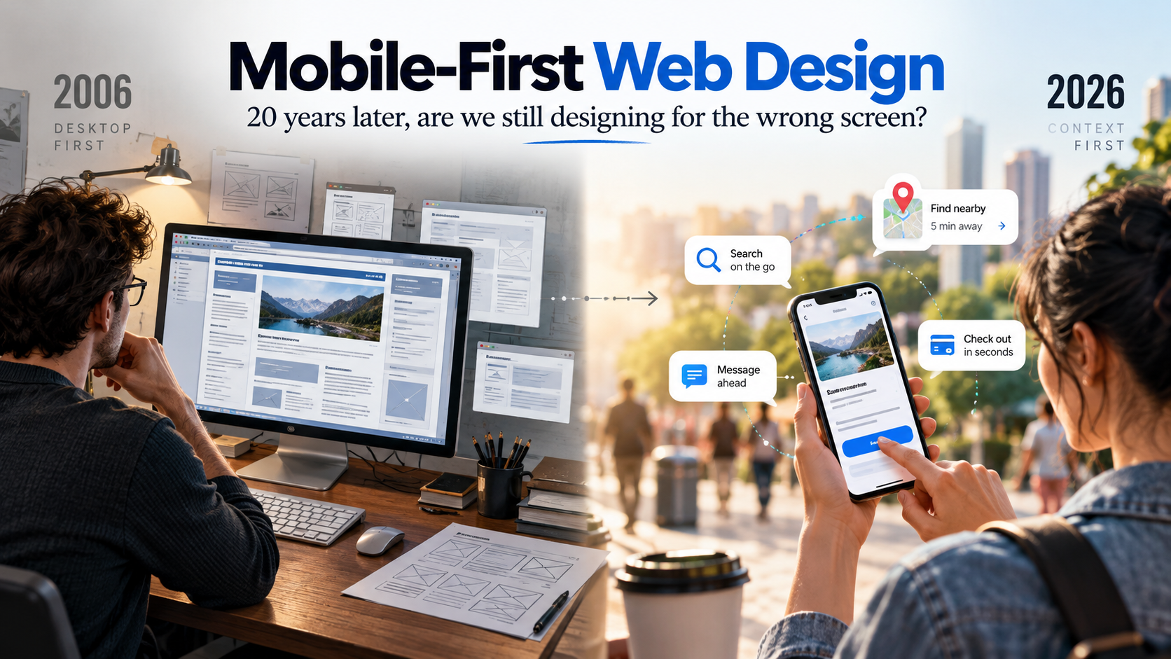
2006: The Website Was Usually a Desktop Experience
The mobile web existed in 2006. It would be wrong to pretend that phones suddenly discovered the internet when the iPhone arrived.
But for most mainstream commercial websites, the dominant assumption was still obvious: the visitor was sitting at a computer.
Designs were built around fixed-width layouts, mouse interaction, desktop browsers and comparatively large screens. Navigation could sprawl. Interfaces could rely on hover states. Pages could assume a level of precision that a finger on a small screen simply does not offer.
In January 2007, Apple introduced the iPhone as a phone, an iPod and an internet communications device in one. Its large multi-touch display made web browsing on a phone feel dramatically more viable than it had on most previous handsets.
That did not instantly make every website mobile-friendly.
It did, however, make the old assumptions much harder to defend.
Then “Mobile First” Became a Useful Provocation
In November 2009, designer Luke Wroblewski published an article simply titled Mobile First.
His argument started from a problem that will sound familiar: mobile versions were often designed after the PC version was complete.
Starting with mobile forced teams to confront constraints earlier. There was less room. Priorities had to become clearer. Interactions had to become simpler. You could not casually fill a narrow screen with every piece of content somebody in the organisation considered important.
Then, in May 2010, Ethan Marcotte published Responsive Web Design in A List Apart, describing an approach built around fluid grids, flexible media and CSS media queries.
The two ideas are related, but they are not identical.
A prioritisation approach
Start with the constrained mobile experience and decide what truly matters before adding complexity for larger screens.
A flexible design approach
Build an experience that adapts to different screen sizes, layouts, devices and capabilities rather than producing one fixed page.
Those ideas changed the web because they challenged something that had previously felt natural.
The desktop was no longer automatically the “real” website.
Google Eventually Made Mobile the Default View of the Web
The shift was not just happening inside design studios.
Google began experimenting with mobile-first crawling and indexing in 2016 and announced in October 2023 that the move to mobile-first indexing was complete.
The logic was simple: if users increasingly experienced websites on phones, Google needed to understand the version of the site those users actually saw.
That created an important practical consequence.
Your mobile site could no longer be the stripped-down afterthought containing less useful content than desktop. For search, the mobile experience increasingly became the version that mattered.
By that point, “mobile-friendly” was not an exotic feature.
It was basic web hygiene.
The Problem: Mobile-First Can Become Another Unthinking Rule
This is where I become slightly uncomfortable with the phrase.
Not because mobile is unimportant. For many consumer websites, it is overwhelmingly important.
But good marketing does not begin with a fashionable design principle.
It begins with the customer.
If your users primarily arrive on mobile, complete the task on mobile and expect the experience to work brilliantly with one thumb, then designing mobile-first makes perfect sense.
But what if you are designing a complex analytics platform used by people sitting at desks with two monitors?
What if the core task involves comparing large datasets, editing video, manipulating detailed layouts or working through a dense professional workflow?
In those situations, pretending that a 390-pixel-wide screen must be the starting point simply because somebody once put “mobile first” into a design brief is not customer-centric.
It is doctrine.
Device-first thinking should give way to context-first thinking
The question is not “Should we always design mobile first?” It is “Which environment matters most for this user, this task and this moment?”
A Smaller Desktop Site Is Not a Mobile Experience
One reason the distinction matters is that responsive layouts can create the illusion that the mobile job is done.
The columns stack.
The menu becomes a hamburger.
The images shrink.
Everything technically fits.
But the user experience can still be dreadful.
A mobile customer may be holding the phone with one hand. They may be outside. They may be on a poor connection. They may have arrived directly on a product page from Google rather than through your carefully designed homepage. They may want one answer and want it now.
That changes the design problem.
Can people actually hit the thing?
Links, controls and navigation designed for a mouse pointer can become irritatingly precise when the input device is a thumb.
How quickly does it become useful?
A beautiful page that makes somebody wait for large assets, scripts and animations is not especially beautiful when they need an answer now.
What deserves the first screen?
Small screens expose indecision. If everything is important, the mobile interface makes the resulting clutter painfully obvious.
How much work are you asking for?
Long forms, awkward selectors and unnecessary typing feel very different when somebody is completing them on a phone.
Performance Is Part of the Design
The modern version of responsive design goes far beyond whether the layout fits on a phone.
Google’s current Core Web Vitals focus on three parts of real-world user experience: loading performance, responsiveness to interaction and visual stability.
That translates into three wonderfully practical questions:
- Does the useful content appear quickly?
- Does the page respond when I interact with it?
- Does everything stay where I thought it was, rather than jumping around while it loads?
This is where web design and marketing performance meet.
Waiting is part of the customer experience.
Accidentally tapping the wrong button because the page moved is part of the customer experience.
Giving up before checkout because the page is fighting your phone is part of the customer experience.
Performance is not an engineering detail that happens after design.
It is part of the design.
The Difficult Bits Are Often the Things You Cannot Simply Remove
Cookie and privacy controls are a good example.
Nobody designs a beautiful mobile homepage and thinks: do you know what would really improve this? A large consent panel covering half the screen.
But websites operate inside legal, technical and commercial constraints. Depending on what a site does and where its users are, consent and privacy controls may need to be presented clearly.
The design challenge is therefore not always to remove friction.
Sometimes it is to handle unavoidable friction properly.
The same applies to authentication, payment security, age gates, delivery choices, accessibility controls and important warnings.
A weak process designs the perfect page first and bolts the awkward reality on afterwards.
A stronger process treats those requirements as part of the experience from the beginning.
What the Big Digital Brands Actually Teach Us
The useful lesson from large digital brands is not that everybody should copy their interfaces.
It is that the experience should reflect the job.
The task is usually obvious
Search for a product, evaluate it, buy it, track it. The mobile experience has very little reason to behave like a glossy corporate brochure when the customer is trying to transact.
The website may not even get the first interaction
A search result can answer a question, show a location, surface a phone number or send somebody directly to the most relevant page. The homepage is no longer automatically the front door.
The phone changed more than screen size
The smartphone brought web browsing, maps, cameras, authentication, payments and apps into one device. Designing for mobile increasingly means designing for capabilities and context, not simply a narrow viewport.
Location and immediacy change the job
When a service depends on where somebody is, where they are going and what they need right now, mobile becomes part of the service itself rather than merely another way to view the website.
The Website Does Not Have to Do Everything Any More
This is another enormous change from the web of twenty years ago.
A commercial website once had a strong incentive to keep everything inside its own walls.
Music players, galleries, community features, maps, downloads, news, booking tools and ecommerce might all be treated as pieces of the website itself.
Today, many customer journeys are distributed across an ecosystem.
Music may happen on Spotify. Video may happen on YouTube. Discovery may happen on TikTok, Instagram, Google or an AI assistant. Directions may happen in Maps. Payment may be handed to a wallet. Tickets may live on a specialist platform. Customer service may happen in an app or messaging channel.
That changes what the website needs to own.
I touched on this when I revisited a house-music website audit I originally worked on in 2009. What struck me looking back was not simply that the sites looked old. It was how much functionality we expected the website itself to provide.
The modern question is often not “How do we put every feature on the site?”
It is “What part of the customer journey should the site be best at?”
Sometimes Desktop Should Be First
This is the part that can get lost when design principles become slogans.
There are perfectly sensible situations where desktop deserves priority.
A B2B user analysing multiple charts at once may benefit from width.
A designer working with layers and detailed controls may need precision.
A finance team comparing columns of numbers may quite reasonably prefer a large display and keyboard.
A long-form professional workflow may be technically possible on a phone while still being something almost nobody wants to do there.
That does not mean the mobile version can be ignored.
It means priority should be earned by behaviour.
If the evidence says desktop is the principal working environment, then starting there is not old-fashioned.
It is appropriate.
The Context-First Website Test
Before deciding which screen comes first, answer five questions.
Who is actually using it?
Customer, employee, analyst, shopper, student, commuter, creator? Different users create different design priorities.
What are they trying to do?
Browse, compare, buy, book, read, analyse, upload, navigate or contact? The task matters more than the trend.
What situation are they in?
At a desk, on a train, walking through a city, on a sofa, in a shop or standing outside your premises?
Which device and input method?
Phone, desktop, tablet, keyboard, mouse, touch, voice or assistive technology all change what “easy” looks like.
What can get in the way?
Slow connections, forms, consent, login, accessibility, payment, small screens and environmental distractions should be designed in rather than discovered later.
So Is “Mobile-First” Still Useful?
Yes.
Particularly because the old desktop instinct has not disappeared.
If an organisation knows that most of its customers arrive on phones but continues designing the desktop experience first because it makes a better presentation slide, mobile-first remains a useful corrective.
But I do not think it should be the final principle.
The phrase came from a moment when the industry needed to stop treating mobile as a reduced version of the real website.
That battle was worth fighting.
But responsive design has evolved. Modern guidance now encompasses not only screen widths, but typography, responsive images, accessibility, user preferences, touch, keyboard interaction and different device configurations.
The web itself has become more contextual.
So perhaps the mature version of mobile-first is not “always start with the smallest screen”.
It is:
Start with the situation that matters most to the user — and make every other situation work properly too.
That is less catchy than “mobile first”.
It is also probably closer to what good design was trying to achieve all along.
Sources and Further Reading
- Apple — Apple Reinvents the Phone with iPhone (2007)
- Luke Wroblewski — Mobile First (2009)
- Ethan Marcotte — Responsive Web Design, A List Apart (2010)
- Google Search Central — Mobile-first indexing has landed (2023)
- web.dev — Learn Responsive Design
- Google Search Central — Understanding Core Web Vitals