

World Smile Day · Brand Assets · Visual Culture
The Smiley Face: How a Simple Symbol Became a Global Brand
Two eyes, one curved line and no obvious owner. The smiley has sold corporate morale, rave culture, grunge, fashion and digital emotion – while proving that simplicity can be commercially complicated.
My relationship with emojis is slightly uneasy.
Marketers are regularly encouraged to use more of them in social posts and email subject lines, presumably because no communication is complete until a small yellow face has clarified that the sentence was meant to be exciting.
I do use emojis, but rarely with complete confidence. My most-used list contains crying faces, laughter with tears, hearts, broken hearts, the facepalm, the sick face, the exploding head, the gritted-teeth expression of social discomfort, the nerd, the wink, the thumbs-up and several hand gestures.
There is also, embarrassingly, a courgette followed by a splash. It is used jokingly. This clarification probably makes the situation worse.
At 41, I sometimes wonder whether my reluctance is generational. I will use emojis with people I know and consider friends, but not in genuinely formal communication. If somebody I have never met fills a cold outreach email with cheerful symbols, my reaction is not greater warmth. It is the suspicion that a sales sequence has arrived wearing a party hat.
That tension makes the smiley face interesting. A smile is one of the most basic signs of human warmth. A smile inserted in the wrong context can feel forced, childish, patronising or mildly sinister.
The smiley became powerful because almost anybody could understand it. It became difficult because almost anybody could use it.
For World Smile Day, the story is not simply about happiness. It is about how a tiny visual device escaped its original brief, accumulated new meanings and became one of the world’s most reusable brand assets.
Two Dots and a Curve
A smiley reduces a human face almost as far as it can go.
Remove the nose, ears, hair, skin, age, gender and almost every feature that makes a person visually individual. Keep two marks for eyes and one curve for a mouth. Put them inside a circle and the brain completes the rest.
That is not visual poverty. It is compression.
The same principle appears in icons, pictograms and the best logos. A successful symbol removes information while preserving recognition. It can be seen quickly, remembered easily and reproduced at almost any size. A child can draw it. A printer can place it on a badge. A club promoter can photocopy it onto a flyer. A software company can squeeze it into a few pixels.
This is why Picasso’s line drawings came to mind when I thought about the smiley. The work looks simple because the artist understands which lines can disappear and which cannot. Reduction is often the result of control rather than a lack of effort.
Marketers sometimes confuse complexity with sophistication. We add detail to demonstrate how much thought has gone into something. Audiences generally do not award points for visible strategic exertion. They remember what they can recognise.
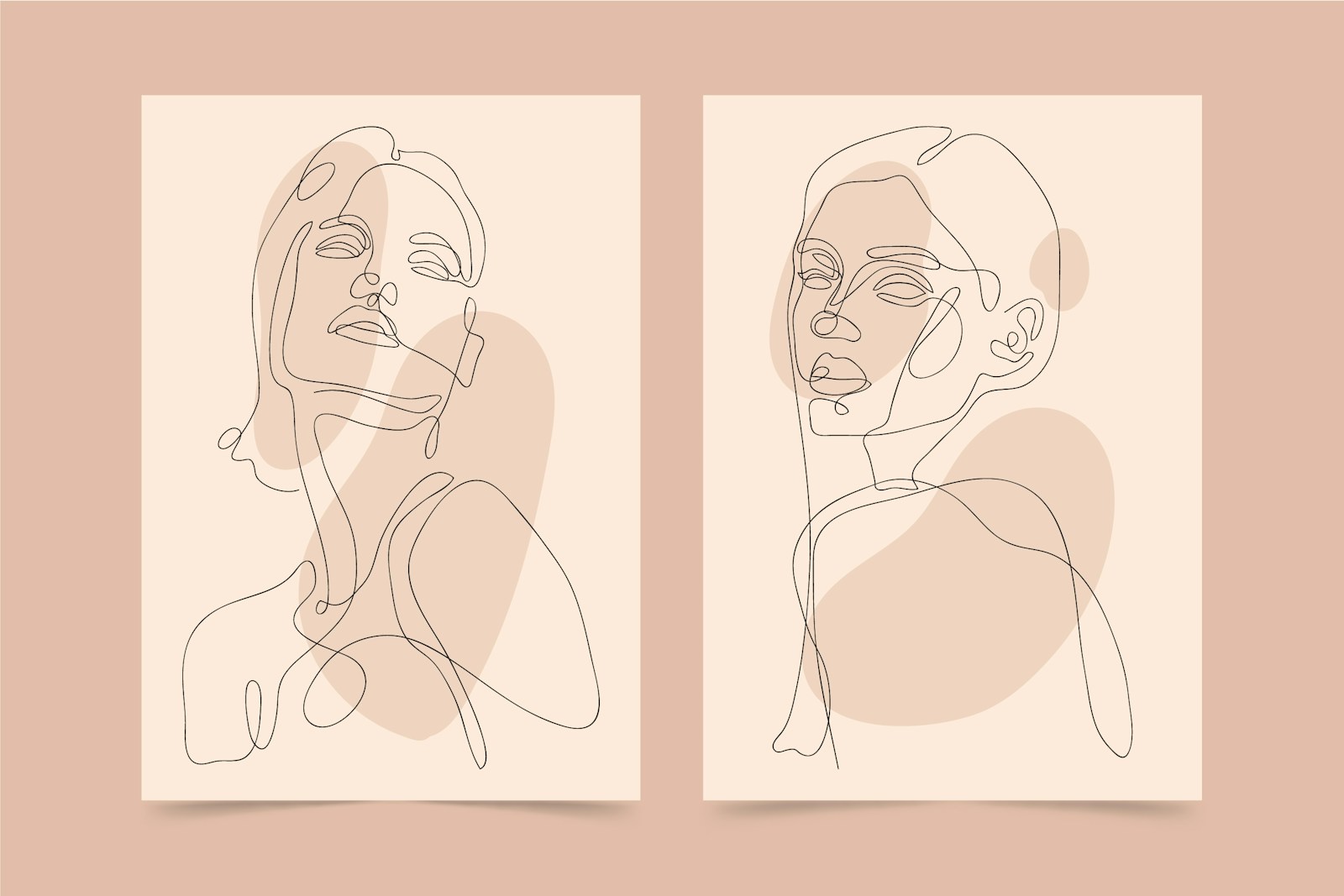
A simple symbol does not contain less thought. It asks every remaining line to do more work.
Distinctive assets become useful when recognition survives reduction, repetition and changes of context.
The Corporate Merger That Needed a Happy Face
The modern yellow smiley is most commonly traced to Worcester, Massachusetts, in 1963.
State Mutual Life Assurance Company had acquired Guarantee Mutual Company of Ohio. The merger caused the sort of internal morale problems that mergers have presumably caused since the first two caves attempted to consolidate their hunting operations.
The company created a “friendship campaign” to encourage staff to smile when dealing with customers and one another. Graphic designer Harvey Ball was asked to create an image for badges and internal material.
According to the history preserved by World Smile Day, Ball completed the design in under ten minutes and received $45. The first order was for 100 badges.
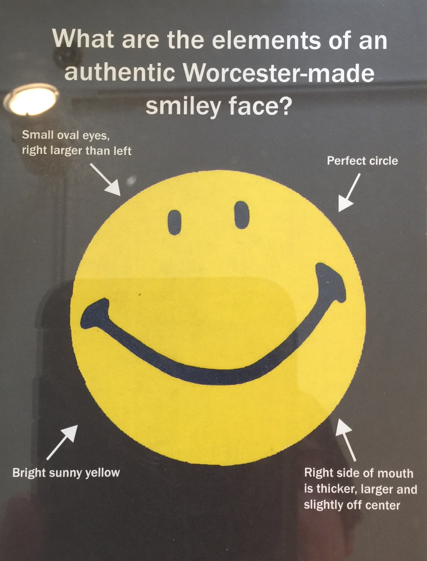
That origin matters. The smiley did not begin as a youth-culture symbol or global licensing system. It began as internal communications following a corporate merger.
It was, in effect, an employee-engagement campaign.
The fact that it survived is partly due to details within the drawing. Ball’s smile was not a mathematically perfect corporate curve. The eyes were uneven and the mouth slightly off-centre. The face was simple, but not sterile.
Demand for the badges grew into the thousands and then the millions. Neither Ball nor the insurance company secured exclusive ownership of the basic design. A symbol made to tell employees to smile became public visual language.
Commercially, that feels almost inevitable. Ball had not invented the human smile, the circle or the idea of drawing a face. He had created a particularly effective arrangement of familiar elements. Protecting that arrangement would prove much harder than recognising its appeal.
One Face, Several Origin Stories
The history becomes less tidy when the smile crosses the Atlantic.
In France, journalist Franklin Loufrani used a smiley to identify positive stories in France-Soir in the early 1970s and registered the design. His family later developed The Smiley Company into an international licensing business.
The company maintains that Loufrani created its version independently and disputes the idea that every modern commercial smiley descends from Harvey Ball’s drawing. Ball’s supporters emphasise the documented 1963 insurance-company design.
For marketers, the useful point is not to referee every historical claim. It is to recognise that simple ideas often have parallel histories. When the ingredients are universal, similar solutions can emerge in different places.
This also separates invention from commercialisation. Ball created an enormously successful piece of visual communication. Loufrani recognised how a related symbol could be registered, organised, licensed and extended.
We often romanticise the first act and dismiss the second as mere business. In reality, turning an image into a durable brand system requires a different form of creativity: legal protection, consistent use, distribution, partnerships and the judgement to know that a tiny yellow face can travel further than a single campaign.
The creator and the commercialiser solve different problems. History does not always reward them equally.
When the Smile Went Raving
When I picture the smiley, I do not primarily see an American insurance company. I see acid house, rave culture and the 1990s.
The timing in my head is slightly late. The symbol became strongly associated with British acid house during the late 1980s. In January 1988, designer George Georgiou used the yellow face on a flyer for Danny Rampling’s Shoom club night. It became inseparable from the Second Summer of Love, appearing on flyers, T-shirts, badges and eventually in hostile newspaper coverage of rave culture.
This is a wonderful example of cultural reassignment. A symbol created to improve corporate friendliness became associated with underground parties, ecstasy, repetitive beats and a government that would eventually legislate against gatherings featuring them.
The face did not change very much. Its meaning changed completely.

I spent a lot of my music-industry career working around house music at Ministry of Sound, but I did not encounter the smiley as a major part of that brand world. By then, much of commercial house culture presented itself differently. It could be stylish, polished, international and slightly more upmarket. The visual language was closer to clubs, DJs, fashion and aspiration than the fluorescent iconography of early rave.
That absence is revealing. Symbols do not necessarily belong to whole genres. They belong to particular moments, tribes and attitudes within them.
A marketer looking backwards might group acid house, rave and Ministry of Sound into one convenient category called “dance music”. The audience living inside those cultures would recognise meaningful distinctions. The smiley was not simply about the sound. It represented a time, a mood and a form of collective identity.
This is why subcultural symbols are so potent and so difficult for brands to manufacture. They gain value through shared use. The audience does not merely recognise the image; it recognises other people who recognise it.

Acid house did not invent the smiley. It gave the smiley a new social life.
The same image moved from corporate morale to collective rebellion because the culture around it changed what it signalled.
Nirvana Made the Smile Uncomfortable
My other immediate association is Nirvana.
The band’s version has crossed-out eyes, an uneven mouth and a tongue hanging to one side. It is recognisably a smiley and clearly not an uncomplicated expression of happiness. That contradiction suits Nirvana rather well.
It also demonstrates how a familiar symbol can be made distinctive through a few changes. The face retains the underlying template but acquires a different personality: damaged, ironic, chaotic and commercially irresistible on a black T-shirt.
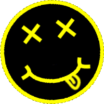
Its authorship remains disputed. Nirvana’s representatives have said Kurt Cobain created it. Former Geffen Records art director Robert Fisher later claimed he designed it in 1991. The disagreement became part of litigation involving fashion brand Marc Jacobs, with the parties reaching a settlement process in 2024 without a court definitively deciding whether Cobain or Fisher originated the face.
It is hard to imagine a better illustration of the ownership problem. The design looks casual enough to have been scribbled on a notebook. Decades later, lawyers were arguing over the value created by those few marks.
Informality can be an aesthetic. It is not evidence that the asset is commercially unimportant.
The Symbol Power Test
A useful brand symbol does more than look attractive. Its commercial power grows when it passes five connected tests.
The smiley is exceptionally strong in the first four stages and unusually weak in the fifth. Its universality created reach while making exclusive ownership difficult.
Source: Marketing Made Clear original analysis, informed by brand-asset and visual-identity practice.
From Smiley to Emoji
The smiley did not become obsolete when communication moved onto screens. It became infrastructure.
In 1982, computer scientist Scott Fahlman proposed using :-) and :-( on a Carnegie Mellon message board to distinguish jokes from serious comments. The face rotated sideways because the available keyboard characters demanded it.
In 1999, Japanese mobile network NTT DOCOMO released Shigetaka Kurita’s set of 176 emoji. The Museum of Modern Art now holds the set in its collection. Kurita’s tiny symbols helped people add emotion, tone and context within the severe space limitations of early mobile communication.
The progression is logical:
- A drawn smiley compresses a facial expression into a symbol.
- An emoticon compresses it into keyboard characters.
- An emoji turns it back into a picture and expands it into a visual vocabulary.

We now have faces for laughter, grief, illness, disbelief, awkwardness, exhaustion and emotions that previously required an entire British pause.
Emoji are sometimes described as a universal language. That overstates the case. Their meaning depends on platform design, age, relationship, culture and context. A thumbs-up can mean agreement, acknowledgement, passive aggression or “I have no intention of continuing this conversation”.
The symbol supplies the face. The relationship supplies the meaning.
Why a Smiley in a Work Email Can Feel Wrong
My own rule is largely relational. I use emojis with colleagues when the professional relationship has also become a friendship. I would find them strange in formal communication from somebody I did not know, particularly in unsolicited outreach.
Research suggests that discomfort is not simply the result of becoming old and joyless at 41.
Studies of workplace communication have produced mixed results, but the pattern is strongly contextual. Emojis can add warmth, clarify jokes and replace some of the missing non-verbal cues in text. In formal settings, however, smiling symbols have sometimes reduced perceptions of competence or appropriateness. Informal workplaces and established relationships change the effect.
This explains why generic advice to “use more emojis” is poor advice. It treats the symbol as though it carries a fixed quantity of engagement that can be sprinkled over copy.
Who is speaking?
A wink from a trusted colleague and a wink from a stranger making a sales approach are not the same message.
Where is it happening?
A Teams chat, customer complaint, legal notice and Instagram caption operate under different social rules.
What must it achieve?
An emoji may clarify warmth or humour. It should not be asked to disguise weak copy, false urgency or forced enthusiasm.
The principle applies beyond emoji. Tone should emerge from the relationship a brand has earned. Borrowing the signals of intimacy does not create intimacy.
The Smile Hidden Inside Amazon
My favourite logos often reward a second look.
Amazon’s mark is an obvious example. The orange line is simultaneously an arrow running from A to Z and a smile. It communicates product range, movement and customer satisfaction with one element.
That was deliberate. Design agency Turner Duckworth describes turning Amazon’s previous underline into a curved arrow that gave “a human face to a corporate giant”. The device remained legible on a website, parcel or app and became more useful as the company expanded.

FedEx provides the other famous example: the negative space between the E and x creates an arrow, reinforcing movement and delivery without adding another graphic.
I enjoy that type of design because it respects the audience. The logo works before the hidden idea is noticed and becomes more satisfying afterwards. The detail does not require an explanatory plaque beside every delivery van.
We have covered the companies together in The Marketing Battle: Amazon vs FedEx, and the visual devices also belong to the wider world of Easter eggs and hidden messages.
The smiley sits at the extreme end of this principle. It has so little visual information that it can function almost like punctuation. The challenge for a brand is to create something equally economical without becoming generic.
When a Logo Becomes an Emoji
Some brand assets are so simple and recognisable that they behave like emoji.
Snapchat’s ghost can appear without the company name and still identify the service. Nike’s Swoosh, Apple’s apple and McDonald’s arches work in a similar way. They are not merely logos placed beside a message. They can become the message.
This is the result of sustained investment, not graphic-design magic. A simple mark starts as an empty container. Repetition, product experience, advertising, distribution and culture fill it with associations.
That is why testing brand recognition matters. Marketers who see an asset every day easily overestimate how widely the public recognises it. As explored in How to Measure Brand Recognition Without Fooling Yourself, familiarity inside the business is not proof of fame outside it.
The smiley had an unusual advantage: people understood the underlying human expression before any company attempted to own it. Most brands must build meaning from a much lower starting point.
The lesson is not “make your logo look like an emoji”. It is to ask whether the asset can become easy to retrieve from memory and useful without constant explanation.
Brands Should Make People Smile – Carefully
I believe the best advertising should be entertaining. Brands can be warm, enjoyable and easy to associate with. Marketing does not become more serious merely because everybody in the advert looks concerned beside a presentation screen.
But there is a difference between creating pleasure and demanding a positive reaction.
A genuinely funny advert gives the audience something. A forced smiley tells the audience how the brand would like to be perceived. Six exclamation marks and three celebratory faces do not automatically transform a routine sales email into a human relationship.
I am hardly blameless. I have a tendency to use too many exclamation marks. An emoji, however, feels like another level of emotional instruction.
The best use of warmth is congruent with the situation. A playful consumer brand can use visual humour naturally. A complaint response may need empathy without cheerfulness. A financial or legal communication may benefit from clarity more than an enthusiastic face wearing sunglasses.
World Smile Day itself emerged because Harvey Ball became concerned that the symbol’s original meaning had been lost through over-commercialisation. In 1999, he proposed a day dedicated to kindness and smiling, held on the first Friday of October.
There is a useful irony in that. The creator of one of history’s most commercialised images tried to reclaim it through an act that was explicitly not about commercial ownership.
The Beauty and Business of Simplicity
The smiley face has survived because it is almost impossibly adaptable.
Harvey Ball used it to lift morale after a corporate merger. Franklin Loufrani developed a licensing brand around it. Acid house turned it into a badge of collective euphoria. Nirvana made it damaged and ironic. Technology multiplied it into a keyboard of emotional reactions.
Each version retained enough of the original structure to be recognised and changed enough to serve a new audience.
That is the beauty of simplicity. It gives culture room to participate.
It is also the commercial danger. The more universal a symbol becomes, the harder it may be for one organisation to own its meaning. Brands need distinctiveness as well as simplicity, and legal protection as well as recognition.
A powerful brand asset should be easy to see, remember and use. It should also be specific enough that the audience knows whose message it carries.
The smiley achieved almost everything except that last part. It became bigger than any one owner – less like a logo and more like a piece of language.
And perhaps that is its greatest success. Two dots and a curve travelled from an insurance office to rave flyers, Nirvana T-shirts and billions of screens because people kept finding new things to say with them.
Even if some of us still prefer to keep them out of formal emails.
Frequently Asked Questions
Who invented the smiley face?
Harvey Ball created the best-known modern yellow smiley for a Massachusetts insurance-company campaign in 1963. Other simple smiling faces existed before it, and Franklin Loufrani later developed and registered a smiley design independently in France.
How much was Harvey Ball paid?
World Smile Day’s official history says Ball received $45 for the design, which reportedly took him less than ten minutes to create.
Why is the smiley associated with acid house?
The symbol appeared prominently in British acid-house promotion during the late 1980s, including George Georgiou’s January 1988 flyer for Shoom. It became a visual shorthand for the scene’s music, fashion and collective euphoria.
Who created the Nirvana smiley logo?
The answer remains disputed. Nirvana’s representatives attributed it to Kurt Cobain, while former Geffen art director Robert Fisher claimed he designed it in 1991. Litigation involving the design did not produce a definitive public ruling on authorship.
Do emojis make marketing more engaging?
They can clarify emotion and add warmth when they fit the audience, channel and relationship. Used mechanically or in formal and unsolicited communication, they can reduce perceived professionalism or feel artificially familiar.
Sources and Further Reading
- World Smile Day – Harvey Ball and the history of the smiley face
- The Smiley Company – Franklin Loufrani and the Smiley brand
- DJ Mag – George Georgiou and the acid-house smiley
- Reuters – The Nirvana smiley authorship dispute
- Carnegie Mellon University – Scott Fahlman’s original 1982 emoticon message
- Museum of Modern Art – Shigetaka Kurita’s original emoji
- Collabra: Psychology – Emojis at work, competence and appropriateness
- Journal of Computer-Mediated Communication – Emoticons in workplace email
- Amazon – The A-to-Z smile logo
- Turner Duckworth – Designing Amazon’s smile