

Brand Assets · Packaging · Brand Memory
Heinz 57: How a Made-Up Number Became One of Marketing’s Most Famous Brand Assets
The famous “57 Varieties” was never an accurate count. Yet the number became unforgettable — because Heinz built a brand from far more than a logo.
When I think of Heinz, I do not really think of the logo first.
I think of the label.
That old-fashioned keystone shape on the ketchup bottle. The familiar structure repeated across beans and soup. The red of ketchup, the green around Beanz, the pale cream of mayonnaise. The number 57. The bottle shape. The tin. The whole thing somehow looking unmistakably Heinz before you have consciously read the word.
That is what makes Heinz interesting from a branding point of view.
The name itself is fairly plain. It sounds Germanic. The logo is not especially elaborate. There is no single modern strapline doing all the work.
Instead, Heinz has accumulated a system of distinctive assets over more than a century. Some are verbal. Some are visual. Some are physical. Some are nostalgic. And several of them are slightly strange.
The clever thing about Heinz is not that it has one brilliant brand asset. It is that so many different cues can independently lead you back to the same brand.
The best example is probably the most arbitrary one of all: 57.
The 57 Was Never Really About 57
Henry J. Heinz came up with “57 Varieties” in 1896 after seeing an advertisement for a shoe company boasting about its 21 styles.
There was one small problem with Heinz’s new line.
By then, the company already sold more than 60 products.
So “57 Varieties” was not an accurate count when it was created.
Heinz’s own history says nobody knows for certain why he settled on 57. Henry later claimed that five was his lucky number and seven was his wife’s, while also believing seven had a broader appeal. Whatever the precise reasoning, the number stuck.
And then it kept sticking for another 130 years.
That matters because marketers often feel pressure to explain every element of a brand as if it must emerge from a perfectly logical strategy document.
Sometimes meaning comes afterwards.
57 became valuable because Heinz kept using it, not because 57 was objectively the perfect number
The number acquired familiarity, association and ownership through repetition. Eventually the question “why 57?” became less important than the fact that 57 felt like Heinz.
That is a useful distinction. Brand assets do not always need to make deep semantic sense. They need to become uniquely and consistently associated with the brand.
What Makes Heinz Look Like Heinz?
The power comes from overlap. Remove one cue and several others can still do the recognition work.
The keystone
The label shape has been used for generations and remains central enough that Heinz still builds global campaigns around it.
57
A largely arbitrary number that became one of the most recognisable numerical cues in consumer branding.
Bottles and tins
Form, proportion and label placement create recognition before a shopper has read the product name.
Red, green, cream
Individual products have their own colour cues while still sitting inside a recognisable Heinz family.
Beanz Meanz Heinz
A slogan can become part of public memory rather than merely a piece of campaign copy.
Taste and ritual
Beans on toast, tomato soup, ketchup on chips: repeated consumption attaches the assets to real life, not just advertising.
Brand theory: the Ehrenberg-Bass Institute describes distinctive assets as non-brand-name cues such as colours, logos, characters, pack shapes and slogans that trigger brand recognition and help build mental and physical availability.
The Keystone May Be More Important Than the Logo
The thing I find particularly interesting about Heinz is the label shape.
The keystone is not merely a decorative border around the name. It is one of those design elements that has become recognisable in its own right.
That was not accidental. The shape references Pennsylvania — the Keystone State — where Heinz began. Historical Heinz bottles were using keystone-shaped labels in the nineteenth century, and modern design work has repeatedly treated the shape as one of the brand’s most valuable equities.
In 2020, a major Heinz masterbrand refresh deliberately standardised the keystone across the portfolio rather than replacing it. Designers talked about finding the “Heinz in the mind”: identifying the version consumers already recognised and making the wider portfolio more coherent around it.
That is a very different philosophy from rebranding for novelty.
And Heinz is still exploiting the asset. In 2025, the company launched a global campaign based on the observation that many takeaway chip boxes happen to resemble the Heinz keystone. The joke only works if the shape is recognisable enough to carry the brand without the full logo.
A brand asset has become powerful when you can remove the brand name and people still know who is speaking.
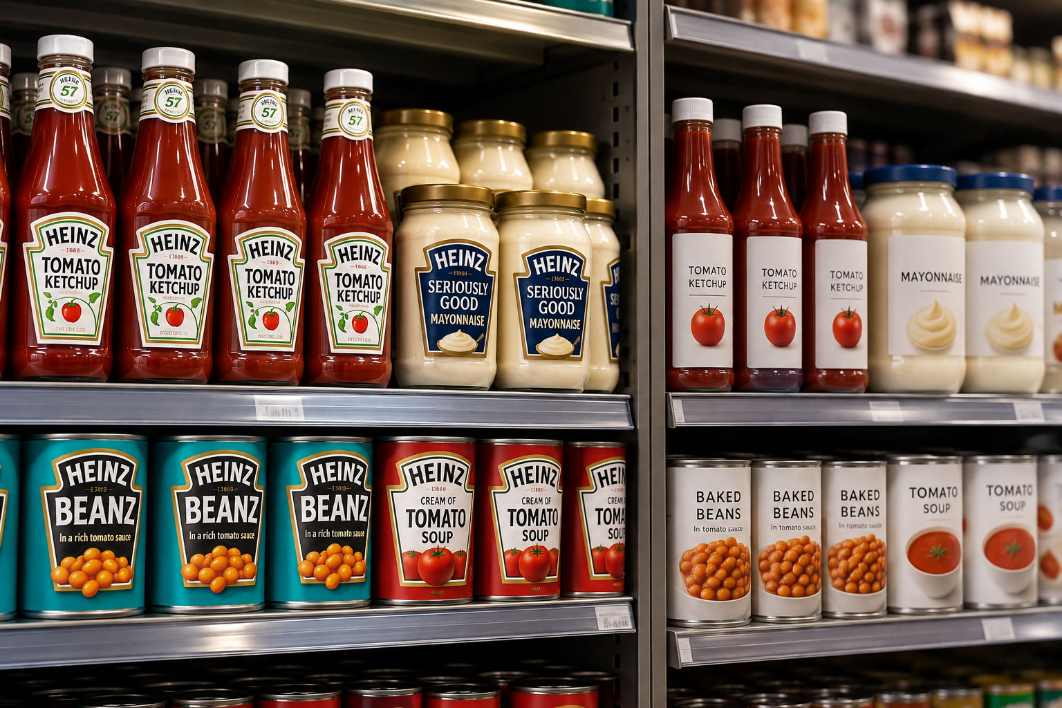
Packaging is not decoration. It helps customers find the product they already know.
A redesign can look cleaner in a presentation and still perform worse on a shelf if it removes the cues people use to recognise the brand quickly.
Watch
Why 57?
This short explainer is a useful companion to the story above: Heinz was already selling more than 57 products when the number became part of the brand.
Why Marketers Get Bored Before Customers Do
This is where rebrands can become dangerous.
The people closest to a brand see it constantly. The marketing team sees the packaging every day. Management reviews the logo in presentations. Designers zoom into details nobody outside the business has ever consciously noticed.
Eventually somebody says it feels tired.
The customer may have seen it for twelve seconds in Tesco last Thursday.
Those are not the same level of exposure.
I am generally cautious about wholesale rebrands for established products. Brands such as Heinz and Coca-Cola have spent decades accumulating recognition. You can modernise them, simplify them and make the system more coherent, but throwing the familiar assets away because a new leadership team wants to “make its mark” can be an extraordinarily expensive act of self-expression.
I have seen the same principle on a smaller scale in my own work. With Paleo Ridge, I have been involved in branding and packaging across Classic, Essentials and Paleo Plus. Those ranges need to evolve, but they also need to remain recognisable to somebody standing in front of a freezer or scrolling quickly through a product page.
The design is not primarily there for the management team.
It is there to help the customer find, understand and choose the product.
By contrast, Marketing Made Clear has changed visually much more freely because it is a younger platform. When very little recognition has accumulated, the cost of changing an asset is lower. Brand equity takes time to build; you cannot destroy much of what does not yet exist.
Rebranding should solve a customer or commercial problem, not a management boredom problem
New leadership is not, by itself, evidence that customers need a new identity.
Tropicana: When Recognition Disappeared from the Shelf
The classic warning is Tropicana.
In 2009, the orange juice brand introduced radically simplified packaging. The familiar image of an orange with a straw pushed into it disappeared, and the pack became much more minimalist.
The redesign may have looked cleaner in isolation.
On shelf, it looked less like Tropicana.
The Pure Premium line reportedly suffered a sales decline of around 20% in less than two months, and the company moved back towards the old design.
There are always multiple variables in a sales result, so it would be simplistic to claim that one design decision mathematically caused every lost purchase. But the episode remains useful because the customer criticism centred on something very basic: the pack had become harder to recognise.
That is the part of rebranding that design conversations sometimes underplay.
A packet is not viewed against a white background on Behance.
It lives beside twenty competitors, at an angle, under supermarket lighting, while somebody is thinking about dinner and wondering whether they remembered toilet roll.
Recognition is not aesthetic nostalgia. It is part of physical availability.
Heinz Does Not Need Every Product to Look Identical
Consistency does not mean making every item visually interchangeable.
Heinz Beanz can lean into green. Ketchup can own red. Mayonnaise can be pale and creamy. Tomato soup has its own cues. Each product needs enough individuality to be useful while carrying enough of the masterbrand to remain recognisably Heinz.
This is a portfolio problem rather than a logo problem.
The Ehrenberg-Bass Institute describes portfolio cohesion as the visual similarity created by consistent use of distinctive assets across products. That does not mean uniformity. It means giving the eye enough repeated information to understand that several different products belong to the same brand family.
Heinz is unusually good at this.
You can line up ketchup, beans and soup and they are clearly not the same product. Yet the label architecture, typography, keystone and broader packaging language make the relationship obvious.
This is what a strong brand system does: it allows difference without losing identity.
Numbers Are Strange Little Brand Assets
57 also belongs to a wider family of numerical brands.
Chanel No. 5. Levi’s 501. WD-40. 7UP. Formula 1.
Most consumers could recognise those numbers without being able to give you a detailed explanation of why they were chosen.
That does not weaken them.
Numbers are compact. They are visually simple. They can be repeated easily. They feel specific, even when the underlying story is arbitrary.
There is also something psychologically satisfying about a number that looks as though it must mean something.
57 sounds precise.
It suggests a history, a formula, a system or a hidden rationale.
In Heinz’s case, the rational explanation is much weaker than the cultural one. The number matters because Heinz made it matter.
The Brand Lives in the Kitchen, Not Just the Advertisement
Nostalgia matters enormously here.
Heinz is tied to repeated domestic experiences in a way many brands would love to achieve.
Beans when you cannot be bothered to cook. Tomato soup when you are ill. Ketchup on chips. Mayonnaise on almost anything if you are me. In our house, ketchup and mayonnaise divide loyalties rather neatly.
Those moments matter because brand memory is not built only through paid communications.
It is built through use.
Heinz Baked Beans became established in Britain in the early twentieth century. Heinz tomato soup followed. “Beanz Meanz Heinz” arrived in the 1960s and became one of those slogans that people can remember long after they have forgotten the advert around it.
The products have therefore had generations to become part of routines rather than merely purchases.
That is a formidable barrier for competitors in categories such as ketchup and baked beans. A challenger is not only competing against taste and price. It is competing against familiarity, visual memory, childhood, household habit and the reassurance of something you already know.
Other sauce categories can feel more open because the category itself permits more variation. Barbecue sauce, for example, can legitimately taste smoky, sweet, hot, American, Korean, sticky or sharp. Variety is part of the appeal.
Ketchup is more constrained. A large proportion of customers already know what “ketchup” is supposed to taste and look like.
That gives the incumbent a different kind of power.
When Familiarity Makes Tiny Changes Feel Huge
There is a downside to this level of familiarity.
Customers notice things.
I have recently found myself wondering whether Heinz ketchup seems slightly more watery than I remember, and whether the beans seem to have a little more sauce. I cannot substantiate that as a recipe change, so I would not present it as one.
But the fact that I notice the possibility is interesting in itself.
When a product has been part of your life for years, the reference point is unusually strong. Texture, pour, sweetness, thickness and even the ratio of beans to sauce can feel like part of the brand.
This is why discussions about shrinkflation, reformulation and pack changes become emotional so quickly. Customers do not experience them as abstract optimisation decisions. They experience them against a deeply familiar baseline.
The stronger the memory, the more visible the deviation.
The Best Rebrands Often Look Like They Did Less Than They Actually Did
That sounds slightly contradictory.
A sophisticated rebrand can involve an enormous amount of work: typography, hierarchy, colour systems, packaging architecture, digital rules, photography, motion, accessibility and global implementation.
Yet the consumer may simply think:
Yes, that still looks like Heinz.
That can be success.
The 2020 Heinz masterbrand work is a good example. The designers did not throw away the keystone because it looked old. They made it more consistent. They strengthened the typography. They created a more coherent system around assets the brand already owned.
In other words, they treated accumulated recognition as something valuable rather than something embarrassing.
Marketers are often attracted to visible transformation because visible transformation looks like work.
Preservation can be harder to demonstrate in a boardroom.
But sometimes the strategic decision is not to replace the thing everybody recognises.
Sometimes it is to stop messing with it.
Heinz 57 Is a Lesson in Accumulated Meaning
If Heinz launched today with the word Heinz in a fairly plain typeface and somebody proposed putting the number 57 all over the packaging despite selling more than 60 products, I am not sure the idea would survive the meeting.
Somebody would ask for the consumer insight.
Somebody else would ask what 57 communicates strategically.
There would probably be a slide explaining that the number lacks clarity.
And yet, more than a century later, removing it would feel like throwing away something valuable.
That is the point.
Brand meaning is not created only at the moment of invention. It accumulates through repetition, experience, advertising, packaging, distribution and time.
The Heinz name matters.
But so does the keystone.
So does the bottle.
So do the colours.
So does the tin.
So does “Beanz Meanz Heinz”.
So does 57.
Heinz is powerful because if you removed any one of those assets, several others would still be standing there saying Heinz.
That is what makes the brand difficult to copy and even harder to replace.
Selected Sources and Further Reading
- Heinz: Our Story — the origins of 57 Varieties, UK expansion and Beanz Meanz Heinz
- Kraft Heinz: 2025 “Looks Familiar” global keystone campaign
- Ehrenberg-Bass Institute: Distinctive Assets Measurement
- Ehrenberg-Bass Institute: Portfolio Cohesion and distinctive brand assets
- Design Week: Heinz masterbrand refresh and finding “the Heinz in the mind”
- The Guardian: Tropicana’s 2009 packaging redesign and reported sales decline