

Website Strategy · Project Management · Digital Marketing
I Wrote This Website Brief in 2014. Here’s What I’d Keep — and Change — in 2026
I expected an old website brief to feel like a technological fossil. Instead, I found a project I am still proud of — and a reminder that the tools change much faster than the questions a good brief needs to answer.
I went back to a website brief I wrote in 2014 expecting to find something mildly embarrassing.
A few dead platforms. Some terminology nobody uses anymore. Maybe a requirement that now sounds like asking whether the website should support electricity.
There is some of that.
The brief mentions Google Analytics and AdWords. It specifically calls out social-media integration because, at the time, that was still something worth specifying. WordPress appears as a preferred CMS before the project ultimately moved to ExpressionEngine.
But the more surprising discovery was that quite a lot of the brief is still good.
That is probably because the project itself worked.
Recycled-Papers.co.uk is still one of the website projects I am proudest of.
It launched in 2015, won the Web Marketing Association’s Best Environmental Website award and won Best Website at the 2015 B2B Marketing Awards. The WebAward credits list me as Arjowiggins Graphic’s Digital Marketing Manager and project lead, alongside Mud’s creative and technical leads. The B2B Marketing winner list records “Recycled papers” for Arjowiggins Graphic UK by Our Name is Mud.
More importantly, the site performed. A contemporaneous company update reported that the first three months delivered a 750% year-on-year increase in website traffic, sample requests rose 350%, and social-media interaction increased 130%.
So this is not really an article about everything 2014 got wrong.
It is about what still matters when the technology around the brief has changed almost completely.
The Domain Was Part of the Strategy
The site was called Recycled-Papers.co.uk, which in hindsight is almost aggressively descriptive.
That was the point.
Arjowiggins Graphic manufactured the products, but many of the people we wanted to reach would not necessarily begin their search with the company name. Designers, printers and end users might simply know that they wanted recycled paper.
The domain reflected the language of the category rather than expecting everyone to arrive already knowing the manufacturer.
The site’s role sat somewhere between SEO, lead generation, education and inspiration.
We wanted people to discover recycled paper, understand the different products, see what could be achieved with them, request samples and move closer to specification or purchase.
That meant the website could not just be an online technical data sheet.
It had to make paper look interesting.
You Cannot Inspire Designers With an Uninspiring Website
The previous site had a fairly fundamental problem.
It did not look good enough.
There were usability issues and the forms were not particularly strong, but the bigger problem was more basic: it was supposed to inspire people who cared deeply about visual design, print and materials, while the website itself did very little inspiring.
That is difficult to get away with.
We therefore treated photography as part of the product experience rather than decoration.
Paper is tactile. A screen is not.
The challenge was to communicate qualities such as texture, surface, gloss and print finish through photography. We organised a substantial shoot using printed examples and props, with lighting designed to make those physical characteristics visible.
Mud’s creative director Matt Powell later described using props, lighting and transitions to emphasise the papers’ tactility and quality.
The website had to make people almost feel the paper through the screen
Photography, lighting, printed examples and interface design worked together to translate a tactile product into a digital experience.
Concept image created for Marketing Made Clear.
My Role Was Much Bigger Than Writing the Brief
I was the project lead and the most involved person on the client side.
I wrote the brief, created most of the supporting documentation, developed the information architecture, wrote much of the copy and managed the agency relationship with Mud.
I had also studied PRINCE2 around that period, so I thought about the project in fairly formal terms. Senior people in the business acted more like the executive or project-board layer, while I was doing the day-to-day work of moving everything forwards.
Looking back, one of the weaknesses of the process was also one of its strengths:
too much went through me.
That kept the project coherent, but it also made me a bottleneck.
In 2026, AI would not remove the need for the thinking, but it would make research, drafting, documentation, content production, QA and iteration dramatically faster.
I could probably run a similar project in a fraction of the time now.
The Parts of the 2014 Brief I Would Still Keep
The technology has changed. The fundamentals of briefing have not changed nearly as much.
Explain the business
An agency cannot make good decisions if it does not understand the organisation, market, audience and commercial context.
Say what is broken
The old site was not visually inspiring enough and was not doing the job we needed it to do. That problem shaped the project.
Know who it is for
Designers, printers and end users did not all approach recycled paper in the same way. The experience had to work across those needs.
Think about structure early
The original brief included an expected page hierarchy because information architecture affects scope, development and budget.
Show what you mean
Competitor sites and examples of elements we liked helped communicate expectations without pretending the answer was to copy them.
Talk about budget
A brief that ignores money is not more creative. It is simply missing one of the constraints the eventual solution has to survive.
I Am More Convinced by Detailed Briefs Now, Not Less
Experience has not persuaded me that detailed briefs are old-fashioned.
Quite the opposite.
I have seen enough website projects go wrong to know what happens when everyone begins with a slightly different interpretation of what they are building.
The agency may deliver what was literally requested while the business discovers that what it requested was not what it actually needed.
A good brief forces those ambiguities into the open earlier.
My later ecommerce briefs have generally become more detailed because the projects themselves have become more complicated. Ecommerce introduces payments, fulfilment, customer accounts, subscriptions, CRM, stock, analytics, marketing automation and a web of integrations that did not sit at the centre of this 2014 project.
Discovery sessions are useful. Workshops are useful. An evolving specification is useful. None of them make clear written thinking unnecessary.
The document creates a shared reference point for what the project is trying to achieve and why.
The CMS Lesson: Be Firm About the Outcome, Flexible About the Tool
The original brief expressed a preference for WordPress.
There was a simple reason: I knew WordPress.
But Mud preferred ExpressionEngine. It was the platform they were most comfortable working with, and at the time they also raised concerns about WordPress being such a common target for hacking.
We went with their recommendation.
With hindsight, I still think that was the right decision.
The project succeeded, and forcing an agency away from the platform it knew well would not automatically have produced a better result just because I happened to know the alternative.
My view today is more contextual.
If I were briefing a conventional ecommerce site, Shopify would often be my starting point. Marketing Made Clear runs on WordPress. Fozzos has been developed using a completely different modern stack.
The technology should follow the job.
A website brief should be precise about the problem and the outcome without becoming unnecessarily dogmatic about implementation.
Some 2014 Requirements Now Sound Delightfully Quaint
One line in the original article notes, with complete seriousness, that we wanted social-media integration.
That dates the document beautifully.
Although even here, the underlying idea was not ridiculous. I wanted content from different parts of the site and social channels to flow together in a more dynamic way. The implementation language has aged more than the concept.
The same applies to specifying Google Analytics and AdWords.
In 2026, I would not write a breathless requirement saying that the website must have analytics as though we had just discovered measurement.
I would instead be thinking about the wider measurement and data environment: analytics, tag management, consent, Search Console, CRM, ecommerce or lead events, first-party data, integrations and who actually owns the accounts.
The tools have become infrastructure.
The brief therefore needs to move one level up and define what the business needs to know.
Mobile Was Important — But It Was Not Yet Mobile First
I was thinking about mobile in 2014.
The site that launched was responsive, and the contemporary launch material specifically highlighted that it worked across mobile devices.
But the mental model was still different.
This was a B2B site aimed heavily at designers and printers who were likely to be researching materials while at work. Laptop and desktop use therefore felt like the primary context.
Today I would still consider the actual audience rather than mechanically chanting “mobile first”, but mobile behaviour would influence the architecture and content decisions much earlier.
The interesting lesson is that responsive design was already arriving quickly. The bigger change since then is that we no longer treat mobile compatibility as a notable feature.
It is simply expected.
SEO Has Not Become Less Important
SEO appeared in the original brief and I would absolutely keep it there.
If anything, I would integrate it more deeply now.
Recycled-Papers.co.uk itself demonstrated the strategic point. The domain used the language the audience was likely to search for rather than assuming people would already know the corporate brand.
Today I would want search intent, site architecture, content planning, redirects, metadata, internal linking and technical SEO considered during the project rather than after someone announces that the website is finished and asks the SEO person to “optimise it”.
AI search adds another layer, but it does not erase the underlying requirement to create useful, crawlable, well-structured information.
Get it right first time remains much cheaper than repairing a site whose structure was never designed for discovery.
What a 2026 Brief Would Add
I would not replace the old document with a fashionable checklist of technology.
But there are areas I would now expect to be considered much earlier.
Define success more explicitly
What should people actually do? Enquire, order a sample, sign up, buy, download, request a quote or move to another stage?
Privacy is infrastructure
Consent management, ownership of customer data and measurement architecture belong in the project from the start.
Think in systems, not pages
Modern websites often sit inside a tech stack connecting CRM, ecommerce, email, subscriptions, analytics and operational systems.
What happens after the click?
Flows and automated customer journeys now matter as much as the page that captures the initial action.
SEO plus AI discovery
Traditional search remains important, while content increasingly needs to make sense to newer AI-driven discovery environments too.
The site has to work
Accessibility, speed, security, staging, testing and ownership of launch checks deserve much more explicit attention.
The Results Made the Argument Better Than the Brief Ever Could
The site launched in February 2015.
The Web Marketing Association later named it the Best Environmental Website in its 2015 WebAwards. B2B Marketing’s official winners list records it as the winner in the website category at that year’s B2B Awards.
That recognition was nice.
The commercial response mattered more.
Our contemporary reporting said the site generated more visits in February and March 2015 than the previous site had managed across the whole of 2014. During the first three months, traffic was reported as 750% higher year on year, while sample requests increased 350%.
Those are the kinds of numbers that make it much easier to persuade an organisation that digital investment is worth expanding.
And that is what happened.
The success of the UK project helped create interest in extending the approach more widely across Europe and into the broader Arjowiggins web estate. I worked on that next phase, but it was one of the projects that never reached launch before the business later went into administration.
That unfinished ending does not diminish what the original project achieved.
AI Changes the Pace More Than the Purpose
If I ran the same project now, the biggest difference might simply be speed.
In 2014, research, first drafts, copy development, content matrices, competitor reviews, meeting notes, documentation and QA consumed a huge amount of human time.
AI can now compress much of that work.
It can help structure research, challenge a sitemap, create first drafts, identify gaps in a specification, compare competitor propositions, generate test cases and accelerate repetitive content tasks.
That does not mean handing the website strategy to a chatbot and wandering off for lunch.
The business still has to decide what it wants to achieve.
The audience still has needs.
The products still need explaining.
The agency still needs direction.
The person leading the project still needs judgement.
AI makes the work faster. It does not make the brief unnecessary.
The Format of a Good Brief Has Aged Better Than I Expected
Technology has moved a long way since I wrote the Recycled-Papers.co.uk brief.
ExpressionEngine is no longer a platform I would instinctively suggest. AdWords became Google Ads. Analytics became GA4. Cookie consent became unavoidable. Marketing automation became normal. AI entered the process. The phrase “tech stack” became something marketers started saying with a straight face.
But the core questions remain remarkably familiar.
Who is the website for?
What problem are we solving?
What does the business need people to do?
What information and experience will help them do it?
How will we know whether it worked?
The tools change quickly. A good brief still gives people a shared understanding of the problem before they start arguing about the solution.
I would write a more detailed brief now.
I would measure more.
I would think more explicitly about conversion, integrations, data and automation.
And with AI, I would expect to get from the first document to the finished website much faster.
But I would still start by writing the brief.
Selected Sources and Further Reading
- Web Marketing Association — Recycled Papers, Best Environmental Website 2015
- B2B Marketing — 2015 B2B Awards winners
- Marketing Made Clear archive — launch results and WebAward announcement, September 2015
- Matt Powell of Mud — photography and design approach behind the Recycled Papers website
- Recycled-Papers.co.uk — historical site terms confirming Arjowiggins Graphic ownership and Mud design credit
Read the original 2014 article and website brief
The original article is preserved here as a historical record, but it has been repackaged into a cleaner reading experience rather than revealing the old Avada page-builder sections underneath the rewrite. I have lightly tidied the presentation while keeping the substance and period-specific thinking intact.
Open the original Recycled-Papers.co.uk website brief (PDF)
Archive · 2014
Sample Website Brief
Creating a brief for a project can be daunting, but seeing a worked example can be helpful. When I was planning the relaunch of Recycled-Papers.co.uk in 2014, I knew the initial brief would set the tone for the project and help align everyone before development began.
The challenge was finding the balance between giving the agency enough information to understand the business and overwhelming them before the project had even started.
Structuring a Website Brief
A clear structure matters. I was — and still am — a fan of using a contents page in a substantial proposal or brief because it sets expectations and shows the reader how the document fits together.
Introduction
The introduction should set the foundations. My approach was to assume the reader had little prior knowledge and explain the organisation, the existing website and what the new site needed to achieve.
For Recycled-Papers.co.uk, that meant explaining the role of Arjowiggins Graphic, the purpose of the site and the opportunity to inspire designers, printers and end users through recycled-paper applications, environmental information and strong visual presentation.
Segmentation — Target Traffic
The brief identified who the website was being designed for. Different audiences would arrive with different needs, so the site had to make sense to designers, printers and end users rather than treating “website visitors” as one undifferentiated group.
I would still make this explicit in a brief today. The terminology and research tools have evolved, but a website cannot be designed properly without knowing who is expected to use it.
Specification — The Main Part of the Brief
The specification was the most detailed section. It covered the current website, an expected page hierarchy, the preferred content-management system, analytics and advertising setup, social-media integration, examples of website elements we liked, and usability and SEO.
Explain what is not working and why the project exists.
Give the agency an early view of the scale and information architecture.
The brief expressed a preference for WordPress, although the final project moved to ExpressionEngine with Mud.
Google Analytics and AdWords were explicitly included in the brief.
Integration was specified rather than assumed — a small detail that dates the document rather nicely.
Both were treated as requirements from the outset rather than something to bolt on after launch.
Timeframe
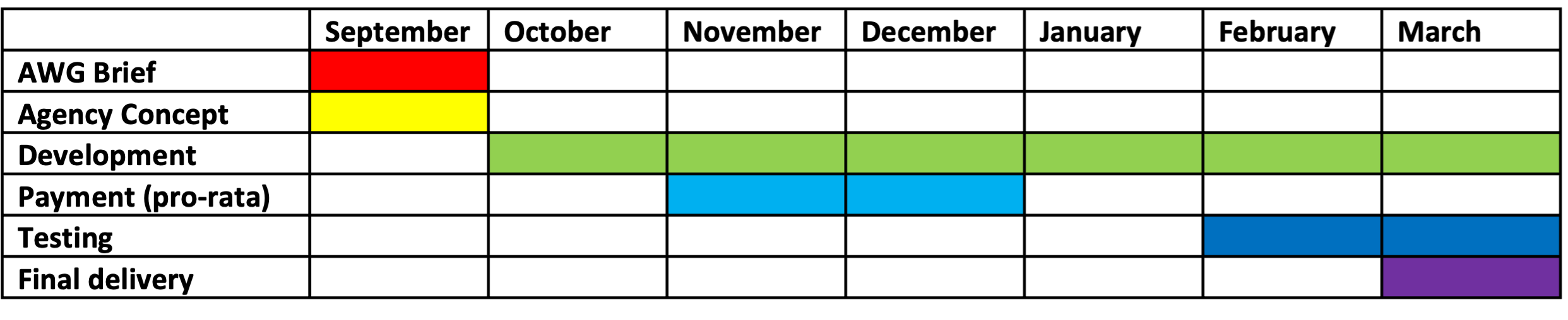
The original article recommended setting out the project timeline early, typically with a Gantt chart, so that milestones, dependencies and key dates were understood before development gathered pace.
Budget
The public version naturally omitted commercially sensitive figures, but the principle was simple: the agency needs to know the budget it is designing against. A brief that avoids the commercial constraint does not make the project more creative; it makes the brief less useful.
Archive note: this is a lightly reformatted version of the original article. The complete 2014 project brief itself remains available in the PDF above.
Sample Website Brief
Creating a brief for a project can be daunting task, but seeing an example can be a very helpful experience. In fact, example-based learning is a widely-used approach in educational and operational settings (Renkl, 2013).
When I was planning the relaunch of the Recycled-Papers.co.uk website in 2014/15, I knew that the initial brief would be of the greatest importance; setting the tone for the development and aligning all parties before the project discussions started. There is a delicate balance between compiling an informative brief and flooding the potential agency with too much information.
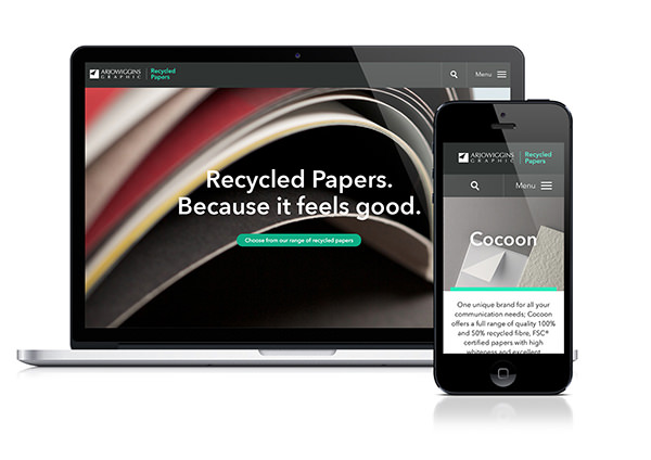
Structuring a Website Brief
As with all documents, a clear structure can help the reader immeasurably. I’m a big fan of adding a table of contents to the start of a proposal or brief – it helps to set the expectation and show what will be covered
The full website brief is available in the link below:
Recycled-Papers Website Brief (PDF)
… the rest of this article will explain the document structure…
Introduction
The introduction should set the foundations. I tend to assume that the reader has no knowledge of the topic; that way you can at least demonstrate the environment from your own perspective.
This brief covers three key areas in the introduction:
- Arjowiggins Graphic – the commissioning company; this is the company I worked for at the time. It is important to provide context to the company even though the project is for a standalone website.
- Recycled-Papers.co.uk – this is the website/project in question. By specifying this it helps to provide context to the scope. If this wasn’t provided then it is possible that the agency may pitch for more than just this website – Arjowiggins had nearly 30 websites at the time.
- Environmental Benefit Statement (EBS) – this is an unusual inclusion in the brief, but adding it was imperative to demonstrate its importance.
Just for added context, the EBS was a web based tool that details the exact amount of; wood, water, energy, waste diverted from landfill and carbon dioxide a company saved by using an given recycled paper made by Arjowiggins. These savings could then be communicated by the company to boast their environmental savings.
Segmentation – Target Traffic
It’s very important to detail who the website is being designed for. This should later be supplemented by detailed research into the demographics and characteristics of the audiences, but this doesn’t necessarily all have to be added into the initial brief. In fact, fleshing out the profiles for these segments would usually take place in the project phase, so it may be best to stick to a top-level detail as I have done. The brief outlines the three main customer types:
- End User/Corporates – end user/corporates are usually marketing or CSR employees working within businesses – often the hardest to reach segment. The website must cater for this audience by showing how they can communicate their ‘environmentally friendliness’.
- Printers – within a printer it is likely that employees would belong to two categories; technical or creative. Technical printing staff are less likely to browse for general information and will probably be looking for technical information relating to the papers. An important target for Arjowiggins Graphic is to raise awareness of the EBS among printers.
- Designers – Designers (in-house or agency/printer based) often have a large say in the paper specification of a print-job as it is their task to visualise the collateral in question. Often designers want to see samples of their paper possibilities and will hopefully wish to use an EBS in their artwork.
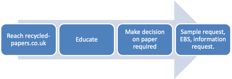
For each of the segments I added a user flow, such as the journey below for End Users:
Specification – The Main Part of the Website Brief
The specification is really the main part of the brief. This is likely to be the most bespoke part of the website. There are a few areas that I would say are critical to this section and others that are “nice to haves”. You must tread the balance between overloading the person reading the document and producing the necessary information.
My Specification covered the following:
- Current Website – this is really the problem statement of the brief; at the time the recycled-papers.co.uk website was not performing to our expectation in a few areas and was in need of improvement. The key measurable are mentioned here – it really explains why we were embarking on a website redevelopment project.
- Expected Page Hierarchy – this gives a draft outline of the kind of pages that will be expected in the design. The reason this is important is that it could have an affect on the development of the website which will in turn affect the timeframe and budget.
- WordPress CMS – At the time there was a preference to use a WordPress CMS – however, throughout the project it was determined that Expression Egine would be a better platform.
- Google Analytics and Adwords – this included a small detail about the setup of analytics.
- Social Media – believe it or not, social media integration wasn’t a given at the time and we had to specify that we wanted to integrate social media with the website.
- Examples of website elements we like – this could easily have been labelled as a mood board or competitor analysis – it really covers both, with a real focus on competitors. My approach is always to take away a competitive advantage, so this section makes sure to diminish the unique selling points of competitor websites.
- Website usability and SEO – this was more of a given; that the website should take into account both usability and optimisation for search engines.
Timeframe
The timeframe is usually demonstrated in a GANTT chart such as the one below. It’s good practice to demonstrate the timeline early in the process in order to set expectations. If there are any key milestones, such as wishing to launch ahead of an event or launching within a financial year; this needs to be made very clear. It is also worth adding any key holiday for staff if that is going to have an impact on the project.
Budget
Clearly I have had to be a bit careful here with sensitive information – but this is where you would outline your budget for the project.
Just as a reminder of the link to the document:
Recycled-Papers Website Brief (PDF)
Renkl, Alexander (2013) “Toward an Instructionally Oriented Theory of Example-Based Learning”. Cognitive Science – A Multidisciplinary Journal. USA.