Website Evaluations – 2009 House Music Websites
As part of the Consultancy Proposal for Housexy – Ministry of Sound Brand, I conducted a website evaluation on the major funky house brands of the time. Looking back, it’s amazing to see how far websites have come, but what a cool era for house music this was!
Hed Kandi
www.hedkandi.com as accessed in 2009.
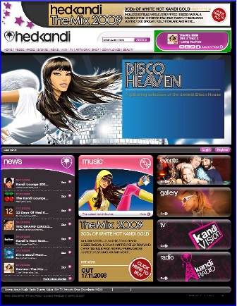
HedKandi’s website contains lots of visual assets such as images and videos. The website also contains a music player on which you can listen to songs while you browse. The website contains is download button which offers mp3s of HedKandi Album’s songs by paying only £1.10. The website is very busy, which makes it had to decipher clear messaging from..
Kinky Malinki
www.kinkymalinki.com as accessed in 2009
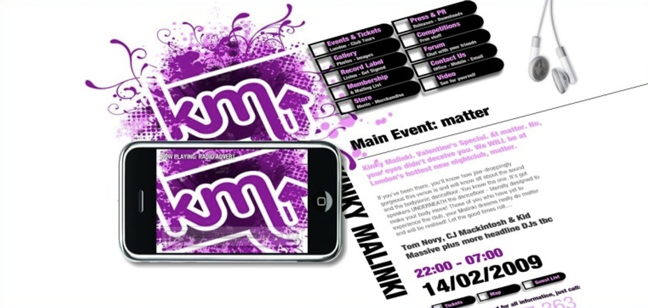
The Kinky Malinki website is one of the best amongst competitors. It is up to date and the new technology; Web 2.0 has been used. On the bottom left there is small player replicating an iPhone which shows photos from events and tours. In addition to this, the website draws you in to learn more. On the negative side; the flash player.
Kiss Da Funk
www.kissdafunk.com as accessed in 2009.
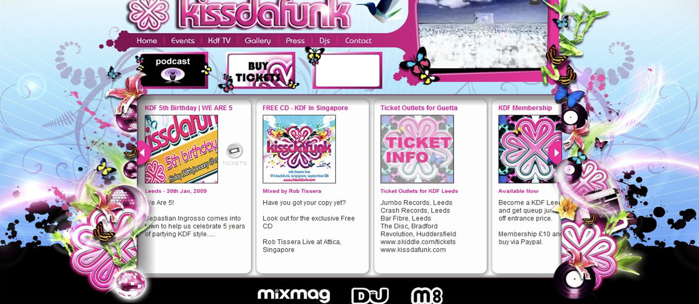
Kiss da Funk’s website like the other ones is formed in mostly pink colors. It consists of lots of visual images and gifs so that makes the web site complicated. It looks childish and the flash player that opens as an intro page in the begining is too noisy. Furthermore, like KinkyMalinki’s website new Web 2.0 services that is podcasting used in the site where you can download and listen songs.
Pukka Up
www.pukkaup.com as accessed in 2009
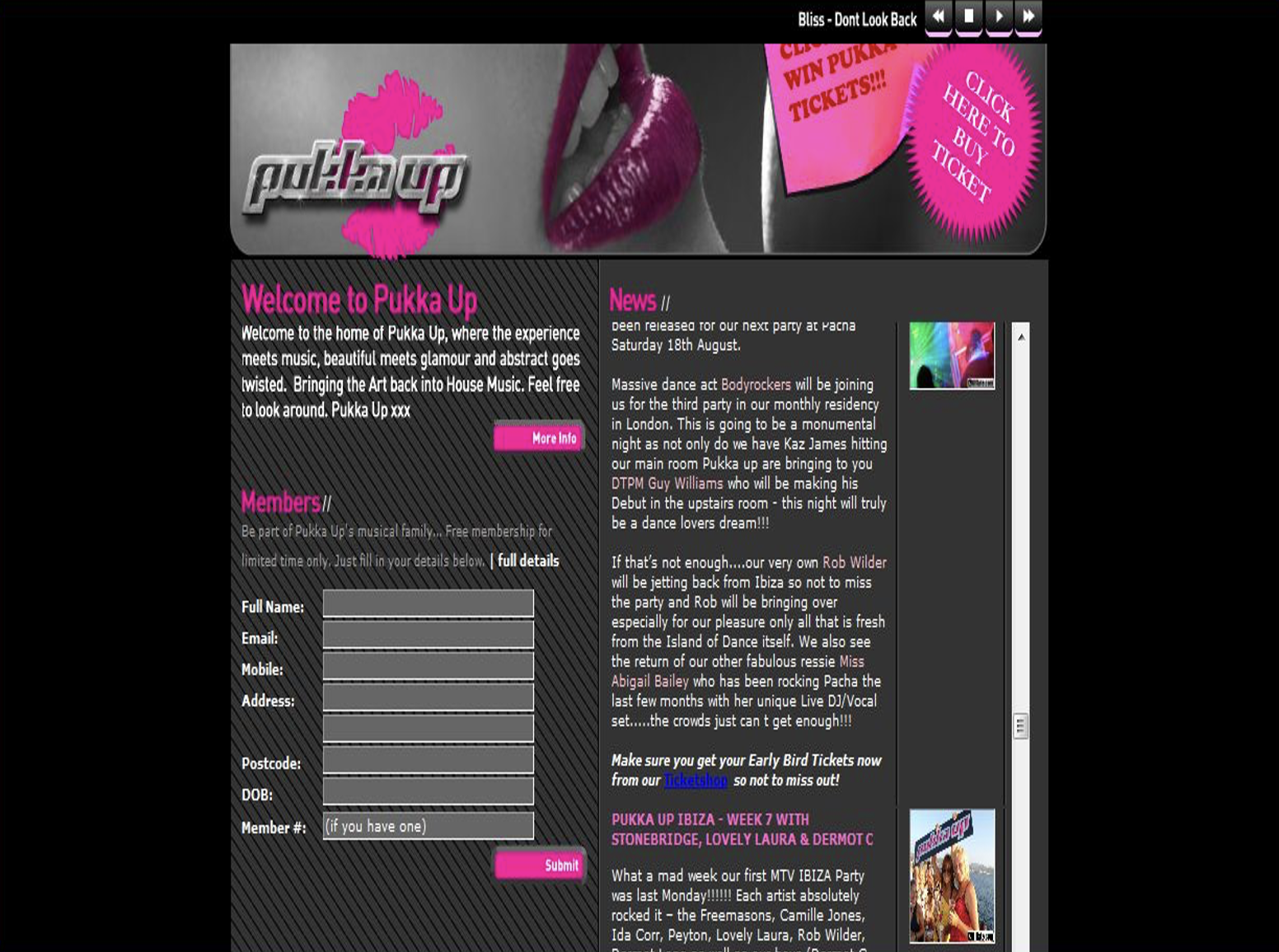
PukkaUp’s website, like Housexy, has a large amount of text using a small typeface which makes it hard to read. There are some photos, but they are too small, it is not possible click on that photos to enlarge. The general colour of the site is black, grey and pink which gives you a glommy feel.
Miss Moneypennys
www.moneypennys.com as accessed in 2009
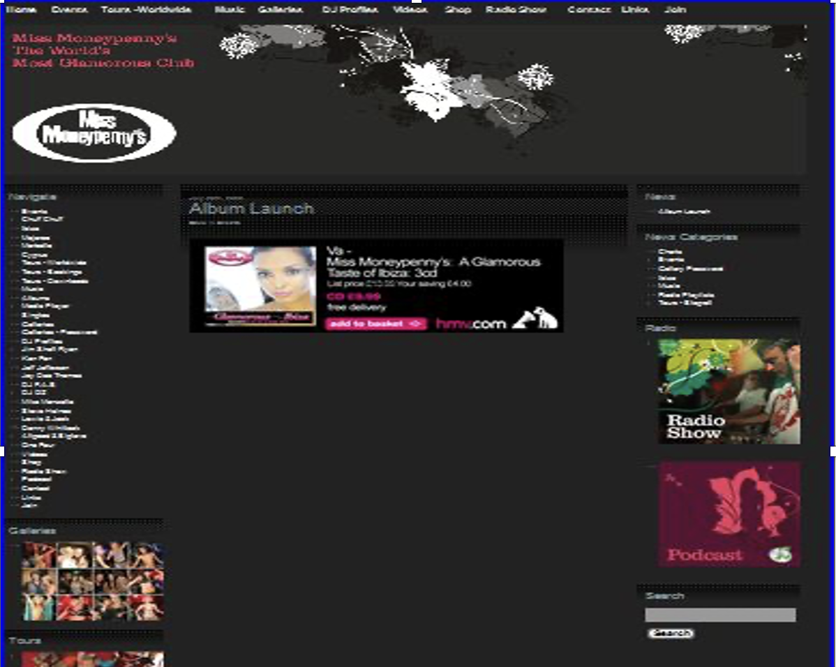
This website is very dark and there is a big gap on the centre of the site which should be the prime location for content. Similar to other competitors they haveo used pink and grey as theme colours. The only good thing for that web site, they used podcast technology which is new Web service that is quite good.
Defected
www.defected.com as accessed in 2009.
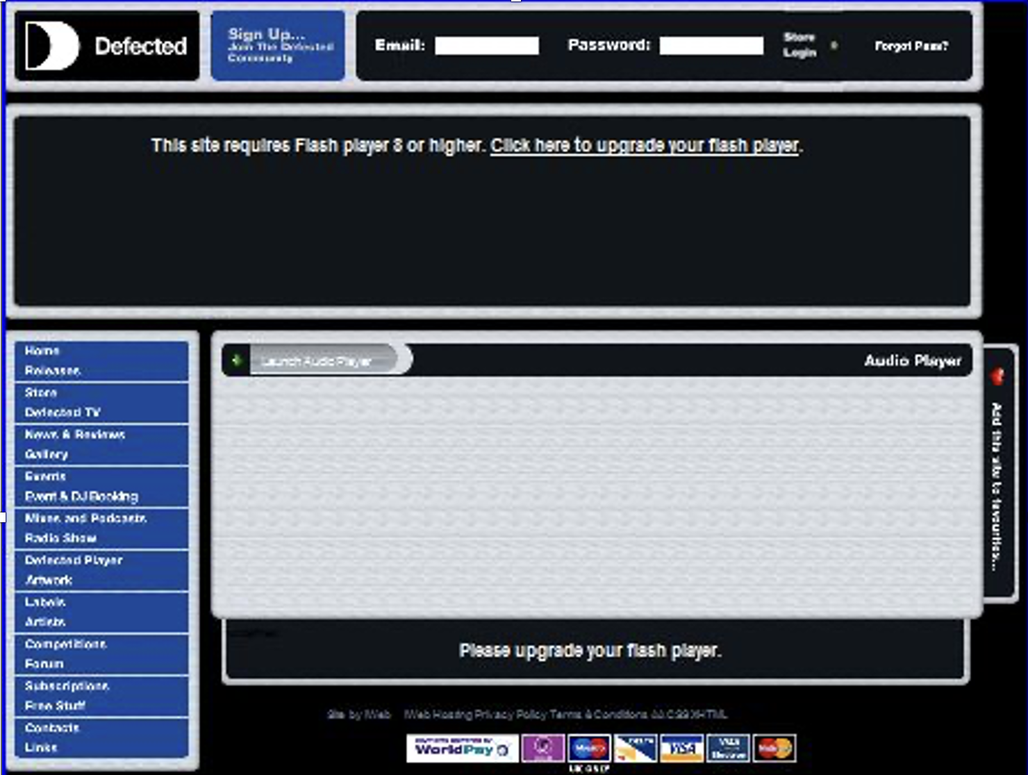
The site requires flash player 8 or higher to see the main heading, which is an oversight. Defected’s web site is not as colourful as the others but it is part of their branding. It is not dark and blue and black are main colours. There is also small flash player which allows the user to listen to sample music. However, without using Flash, there is not much in the way of visual assets.
Housexy
www.housexy.com as accessed in 2009.
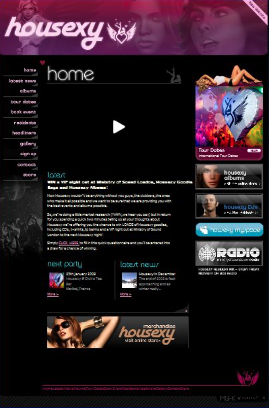
Housexy’s website like all the others is consisting of black and pink colours. The heading of the web site is very striking, within which there is a big logo of Housexy in pink and white. Housexy’s website does not contain too many visual assets like the other ones. There is a flash player on the main page but if you do not click it, it does not play which is not ideal for the web site because when you first open the page it looks like a black hole.
Suggestions include ….
- Place more visual assets.
- Change the flash player.
- Insert a download button which visitors can purchase mp3s by paying.
- Add a Radio player which allows visitors to listen sample songs.
- Reevaluate the colour schemes to be more consistent.
- Add a blog on web site where visitors can write their comments.
- Utilise Podcasting techology.
Google Anlytics for Housexy’s Website (2008) www.housexy.com
According to Google Anlytics (2008) between 1 January 2008 to 11 November 2008, 30,733 people visited the web site from 143 countries/territories, UK and USA have the highest percentage.
Top traffic sources came from search engines and referring sites. Visitors spent 01:21 on average, but most visits lasted 10 second (bounces). It is clear that they did not spend so many times in the site because as mentioned previously Housexy’s web site is not engaging enough. Mostly people reached Housexy’s web site via Google search. They usually searched these keywords; (housexy, sexy.com, shane kehoe, housexy ibiza).
As seen on Google Anlytics, most of the visitors are reaching Housexy’s by referring sites. So to track more visitors, Housexy can use more keywords to attract search engines. In addition to this, if Housexy changes the theme of web site and adds some new services like download songs or radio flash player where people can listen sample songs, it will draw more visitors to the web site.


